【Web Design Inspiration Collection】 100+ Design References for "Affiliate Marketing - Refer-a-Friend - Contact Us" (Incentives/Contact Forms)
【Web Design Inspiration Picks】100+ Examples of "Affiliates"
Collecting hundreds of web design inspirations, including curated affiliate marketing pages, refer-a-friend designs, and clear, concise contact methods to enhance brand trust.


Curating Over 10,000 Web Designs to Extract the Most Essential Inspirational Examples ✨
Welcome to the sixth installment of our Web Design Inspiration Series! Although the next task of sorting through the extensive collection of landing pages is daunting, giving up is not an option since half of the submissions are already done. This batch of inspirations comes from major sites like Lapa Ninja, Land-book, and Landingfolio. The tags and basic categorizations have been prepared for you, just like in the previous submissions. I hope you enjoy it, and let’s keep pushing forward! 🙆🏻♀️
【Web Design Inspiration Picks】After initial planning and sorting, there are 10 different page themes in this series, with five articles already posted and approved. Click on the titles below to download and save them!👇🏻
1.【Web Inspiration Picks】700+ Examples of "About" Page Designs
2.【Web Inspiration Picks】600+ Examples of "Product" Page Designs
3.【Web Inspiration Picks】800+ Examples of "Pricing" Page Design
4.【Web Inspiration Picks】400+ Examples of "Customers & Showcase" Page Design
5.【Web Inspiration Picks】500+ Example of "News, Blog & Careers" Page Design
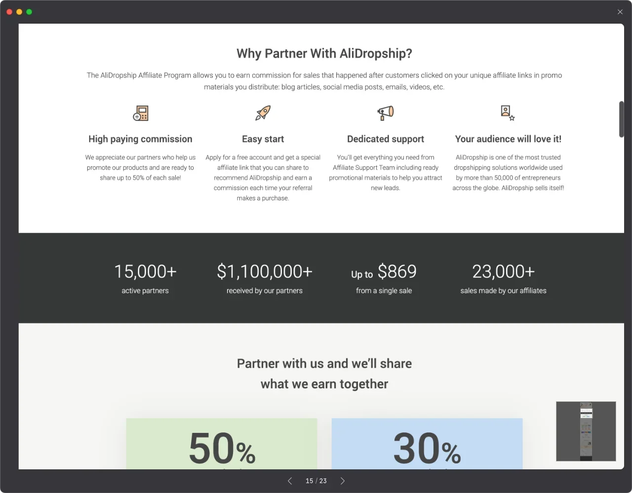
💫 Three Essential Design Elements for Affiliate Marketing Pages You Can’t Miss!
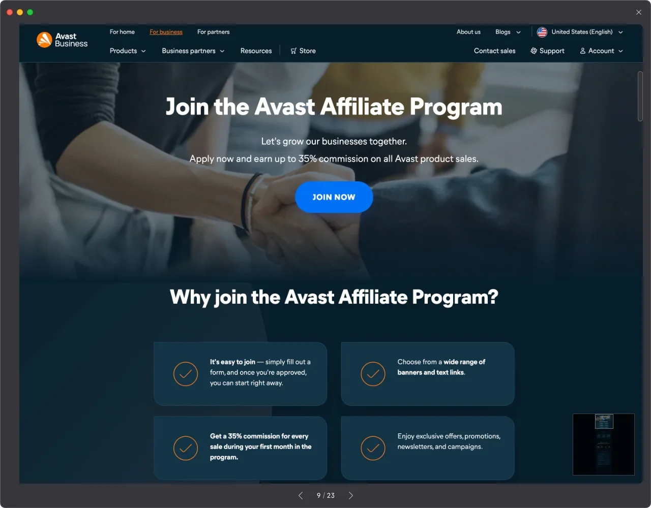
Many SaaS, software, and cloud storage products are actively using affiliate marketing, especially in the SaaS sector where this trend is more pronounced. When designing a dedicated affiliate marketing page for your product, the following three points are crucial. Not only will they help potential partners quickly understand the value, but they will also significantly increase engagement.
Clearly Communicate Value Proposition:
Highlight the product’s advantages and uniqueness, showing how it helps users achieve their goals and expectations.Showcase Features and Benefits:
Use images and dynamic visuals to demonstrate the expected benefits of affiliate marketing. These displays should be intuitive and captivating to potential partners.Call to Action:
Provide clear calls to action to encourage potential partners to learn more, register, or try the SaaS platform. Set prominent "Register Now" buttons or "Free Trial" invitations to prompt visitors to take action.
Three Key Elements of "Refer a Friend" Page Designs That Make Sharing Irresistible 💖
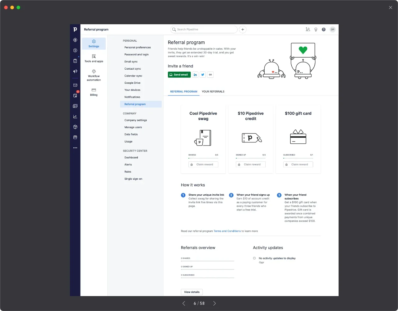
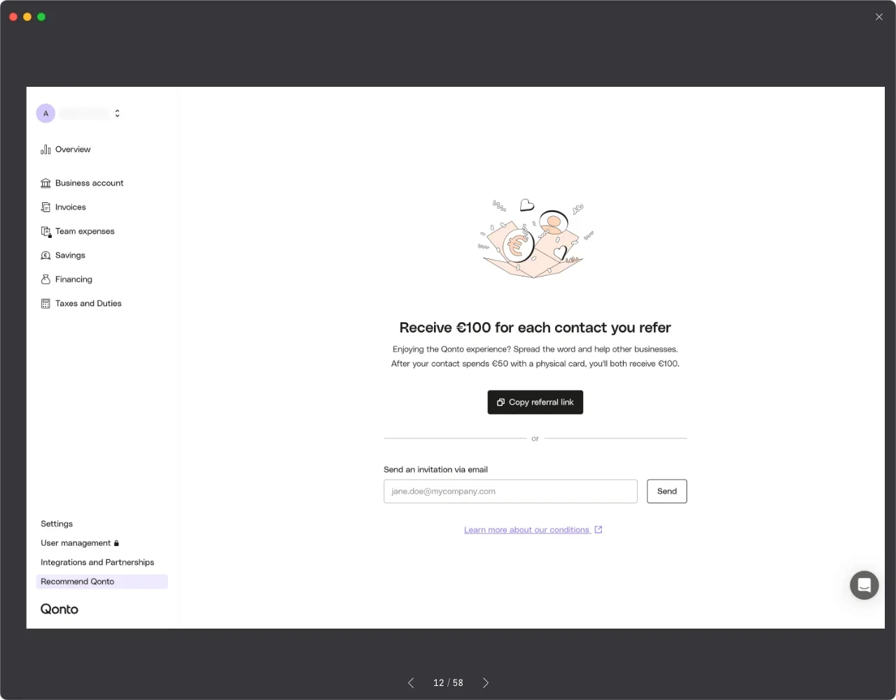
Remember those viral games and quizzes that flooded social media? They can be considered a type of "refer a friend" page design. If you want to design a clear, shareable referral page, focus on visual aesthetics because everyone loves beautiful things!
Engaging Presentation:
Whether it’s a simple introduction page or a well-designed quiz game, pairing it with stunning visuals will attract visitors. Adding a touch of fun to the content will also encourage users to share it on social media.Clear and Concise Introduction:
Provide a brief and clear introduction to help visitors quickly understand the referral process and benefits. Avoid excessive text and focus on clearly explaining how to refer friends and the potential rewards or discounts.Clear Call to Action:
Provide a clear call to action to encourage visitors to participate and start referring friends. Set an eye-catching "Start Now" button or similar prompt to make it easy for visitors to begin referring friends.
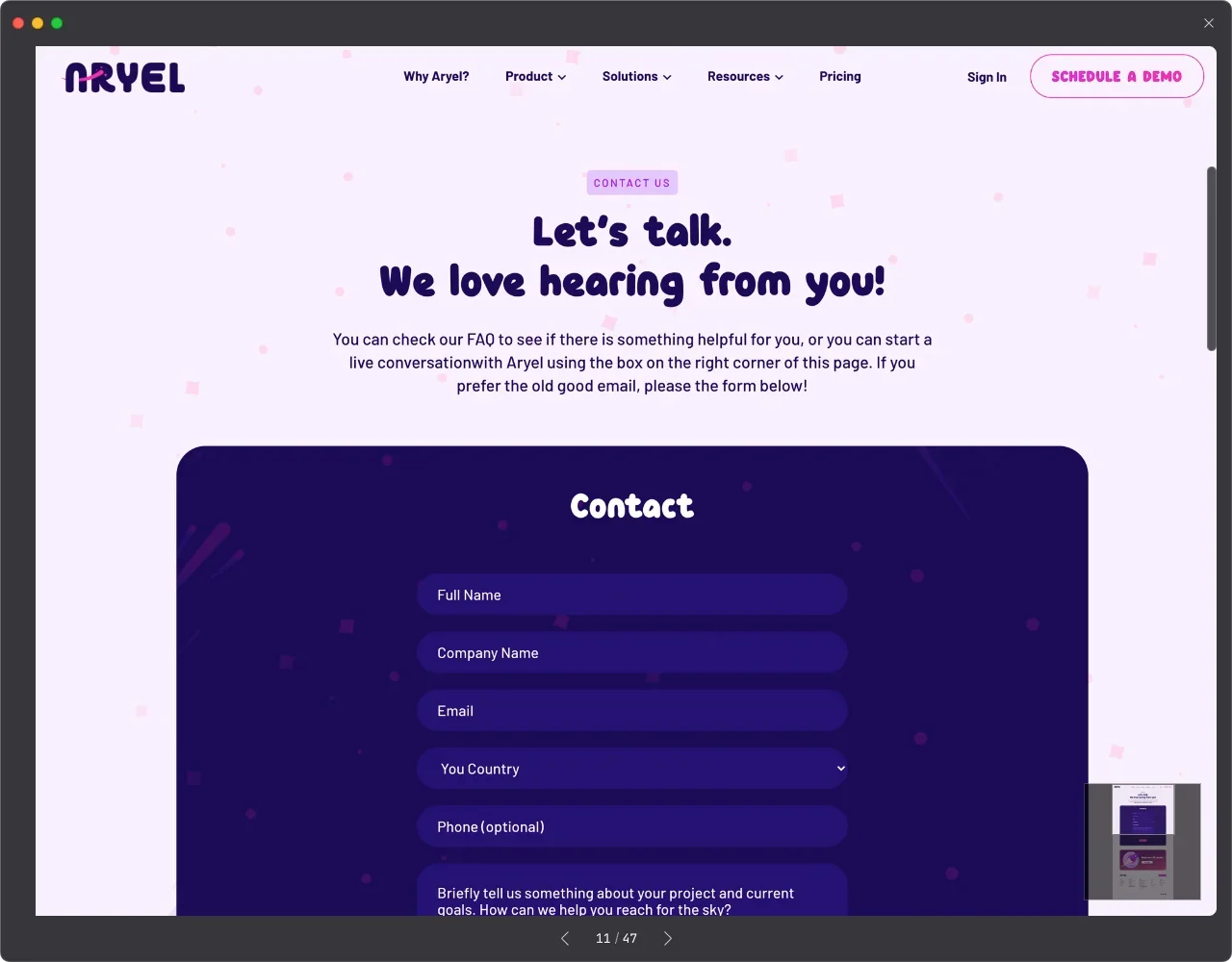
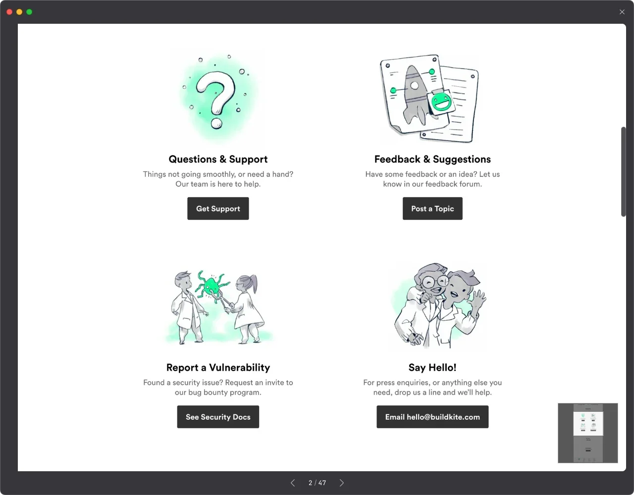
Clear and Convenient Contact Methods to Enhance Brand and Company Trust 📈
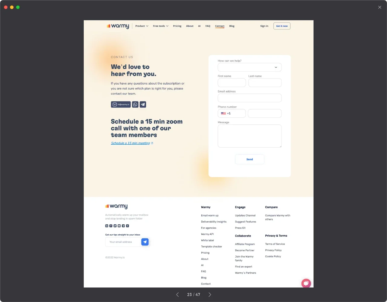
Clear Contact Information: Provide clear contact channels, including email addresses, phone numbers, mailing addresses, and a company location map. This information should be easily accessible and clearly presented, allowing visitors to communicate with the company effortlessly.
User-Friendly Form Design:
If offering a contact form (as most companies do), ensure it is user-friendly and easy to fill out. The form should include necessary fields and use clear labels and instructions to guide users.Immediate Feedback and Response Mechanism:
Ensure visitors receive timely feedback after submitting a contact form, such as a thank-you message or an automatic reply email. Additionally, have someone responsible for promptly responding to emails or other contact methods to create a positive customer service experience.Attention-Grabbing Call to Action (CTA):
Highlight the CTA on the webpage to encourage visitors to contact the company. This could be a prominent "Contact Us" button or an incentive guiding visitors to fill out the contact form.Engaging Presentation:
Whether it’s a simple introduction page or a well-designed quiz game, pairing it with stunning visuals will attract visitors. Adding a touch of fun to the content will also encourage users to share it on social media.Clear and Concise Introduction:
Provide a brief and clear introduction to help visitors quickly understand the referral process and benefits. Avoid excessive text and focus on clearly explaining how to refer friends and the potential rewards or discounts.Clear Call to Action:
Provide a clear call to action to encourage visitors to participate and start referring friends. Set an eye-catching "Start Now" button or similar prompt to make it easy for visitors to begin referring friends.
